Interface and Visual Style
Hey pilots! Welcome to part 2 of my blog on the exciting (yes I said it!) world of game interfaces and menus. In this part, I’ll be chatting about visual design verses the practical needs of a player and I’ll also be unveiling Rogue Star ACE’s brand new menu design and explain my thoughts behind it. Let’s get straight to it!
Graphics, baby!
As I discussed in part 1, good user interface (UI) design should make whatever information is being shown easily understandable to a player. In essence, keep things simple yet concise, the hallmarks of great usability. However, if that was all that was required, there would be a lot of very boring, yet awesome functioning UI designs!
Style over content
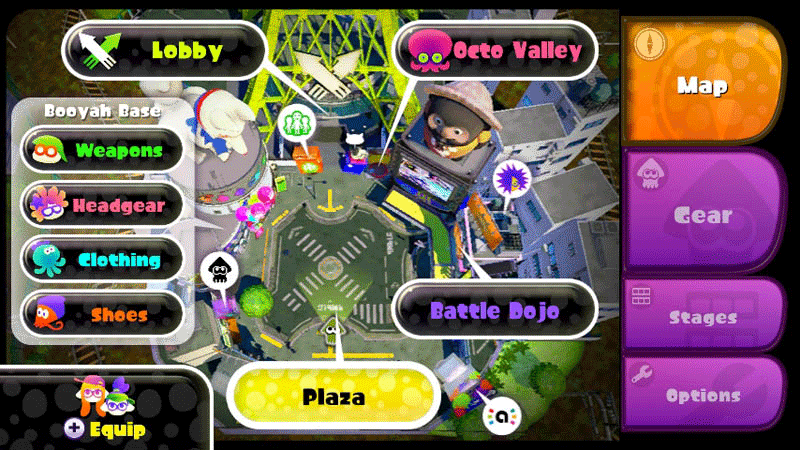
What we need is some style, some graphics, some panache! And it’s here where many designs can slip up. In the rush to make a UI look good or fit into a game world, usability can become lost and player frustration sets in. Therefore, it’s essential that these two needs work together in harmony. Splatoon is an example which, I think, treads this path very well. The image below illustrates fantastic use of fonts, menus, sizes, colours and style to provide a cohesive system which still remains understandable.
A brand new world
So without further ado, let’s jump into Rogue Star ACE’s new menu design!
First off, you’ll immediately notice the general layout is retained from the earlier updated version. After receiving positive feedback, I felt that the simplicity and flexibility of the design would provide a strong foundation for the sequel. As I noted in part 1, the font design, panel spacing and button sizes were all carefully considered to give maximum usability and cut out dead space.
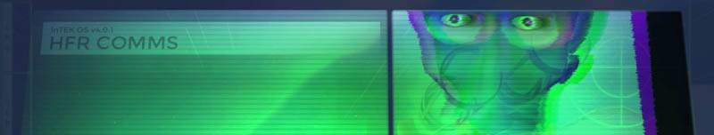
Of course, the biggest change is visually. Gone is the flat 2D look, replaced by a fully 3D one in the form of a holographic display. This is a total overhaul of the original’s menu system and is intended to mimic pilots internal visor displays. My hope is that this visual style doesn’t compromise the presentation of information to the player, but compliments it by adding an immersive consistency to the game world. Going forward, the visual design will continue to evolve as I add more menu screens and mechanics to support ACE's new features.
Next time
In part 3, I’ll be taking this further and showing you how the menu design will drive the new features of ACE, along with possibly a look at the new Star Map! It’s going to be pretty epic! I hope you enjoyed this look at the new menu. Please let me know what you thought about it, feedback is always appreciated and listened too. And please subscribe if you haven’t already.