Interfacing Menus (Part 1)
Interface menu design is regularly the unsung hero of video gaming. It plays an important part in how we interact with a game’s systems and can literally make or break a title. Oddly, a good one can often go unnoticed, yet use a bad one and you’ll very quickly notice it! Let’s chat a little about the exciting (I’m not kidding!) world of menu design and how Rogue Star ACE’s one will hopefully be in the good camp and earn that coveted unsung hero status.
Keep it clear
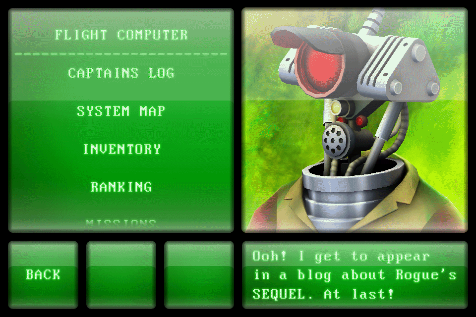
First off, what makes a good interface? In my opinion, it should first and foremost adhere to one principal rule; provide easy access to the information available. Everything should be subordinate to that one absolute requirement. Around it, other considerations can orbit, but never increase in importance. This rule was what led to the original Rogue Star’s menu design. The design called for an easily navigated and comprehended interface design, one which would work on small screen sizes and be touch driven. This required making the absolute most of the screen space available and ensuring that font legibility and buttons sizes were all given a high importance.
As you can see, the final design of Rogue’s menus and interface was heavily focused on providing the player with information in a clear and concise manner. Extra large standard fonts and buttons were prioritised and placed on the screen in an even, consistent design. It’s easy to forget now, quite how small the iPhone 4 (Rogue’s target device in 2011) screen size was back then. That meant that borders were needed to clearly delineate between different panels. Good design is often about compromise and the interface needed to strike the right balance between usability and the amount of information shown.
We can rebuild it, we have the technology
Let’s now move on and consider how this design can be built upon, given the advances in technology and physical screen sizes. The decision to build the sequel around the Nintendo Switch immediately gave the original interface’s design ethos a lot more space to breath. This is due to the Switch’s far larger screen size along with the added ability to be docked and shown on televisions. Check out the following video, which showcases a 9 month old, test design.
As you can see, the original game’s initial design template is still strongly visible, but around it big changes are possible. Gone is the original font, replaced with a simple stylish one, which is far more legible at different video and physical sizes. This allows for greater flexibility when dealing with ACE’s more complex menu and game mechanic requirement. Borders are hugely reduced and everything can be larger than before, yet also fit more on-screen.
So, how does this translate into the actual current menu design? Well I’ll leave that for part 2. 🙂 There, I’ll reveal the up-to-date interface design and discuss how its visual representation provides tough challenges, because no matter how intuitive a design is, it’s got to look cool right? Thanks for reading, pilots. Please leave a comment if you liked this post or if you have a question. I love to hear players' own thoughts on these types of subjects.